Of course, there are plenty of websites with free stock imagery and graphics out there. Finding the perfect picture is easier than it’s ever been. So, surely once you’re covered legally, the rest of the design process is plain sailing?
Not necessarily.
When a graphic designer starts a project, they’re thinking about a whole heap of things. Things that people tend to overlook when creating something themselves.
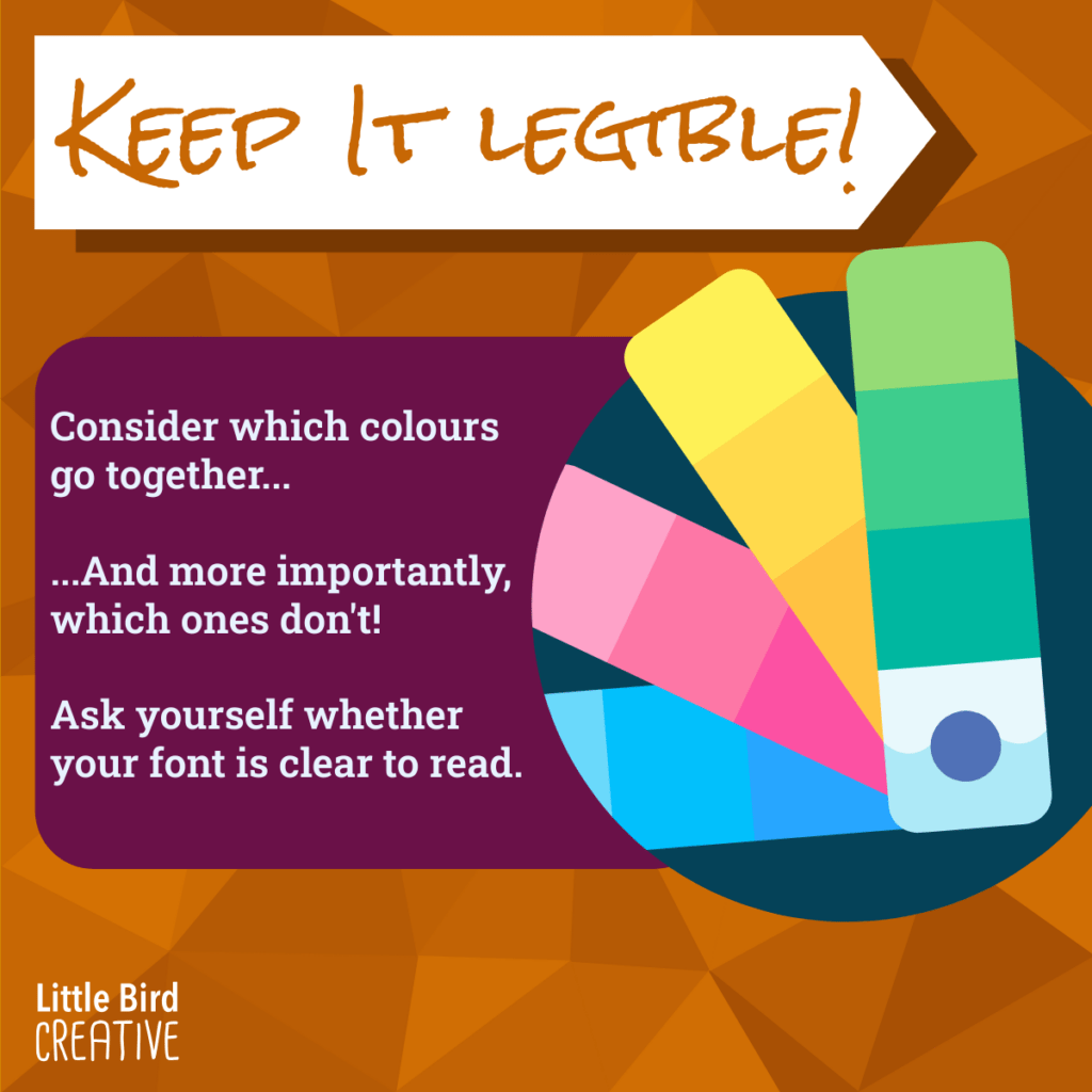
They’ll be considering accessibility – whether the colours used will stand out without clashing, whether there is a high enough level of contrast between the background and the font colour and whether the typography is legible to all readers. If they’re designing for screen, they’ll be adding ALT text to any imagery used.
They’ll be considering printing and how easy it will be to take a design that looks good on screen and make it sing on paper, too. Even the program used to design a flyer or poster, as well as the file type it’s saved as, has a big impact on the final, printed product.
They’ll be thinking about consistency and whether what they’re creating fits your brand identity. When individuals engage in a bit of DIY graphic design, they often lose sight of the importance of sticking to one or two recognisable brand fonts and a branded colour palette, as the appeal of using “a bit of everything” can be too huge to resist!